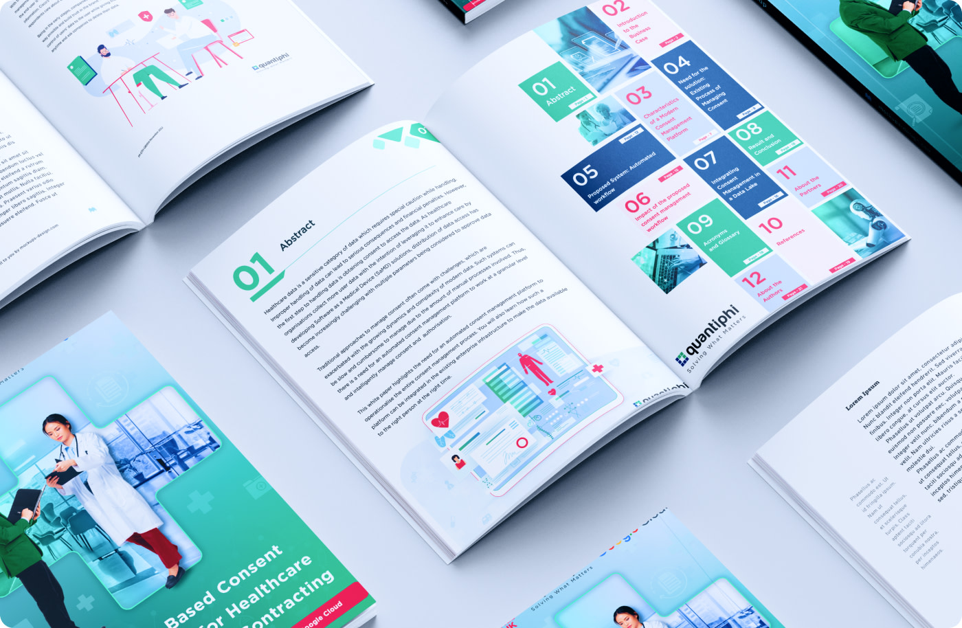
Goal of this white paper is to give insight on Obtaining consent for healthcare data access has become a challenge for organizations. Focused on creating an eye-catching cover that represents the content and appeals to the target audience. The colour scheme is visually appealing and consistent with the branding and at the same time depicting brand personality of healthcare.
Aesthetic Appeal:
Visual Harmony: Use of balanced layout with symmetry, proportion, and visual flow creates an aesthetically pleasing experience, which has a positive impact on user perception and engagement.
Spacing and Alignment: A proper use of white space and alignment created a clean, organized appearance that makes content easier to read and digest.
Visual Clues: I have used flat and simple icons that have added visual interest and created the design more engaging and dynamic.